Today on the Altered Pages Blog
Linda Chaves
shares some of her AMAZING ART!!!
Sunset over the Western Ghats, India
Wisdom
Pink Dreams
A simple piece using acrylic inks, Indian inks and fluid acrylics over Yupo, A4 size. Graffiti in white acrylic ink. A piece in my trademark neon pink!
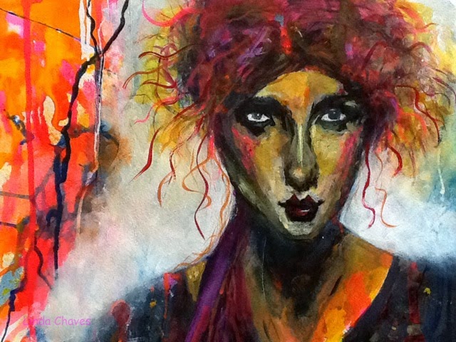
The Pout
Watercolour paper, 30 x 20 cm I started with Indian inks, rolling them about the paper to form a very energetic first layer. I added swathes of more ink with a wipe. I then found an inspiring photo online (this one a portrait by the artists Malcolm Liepke, and interpreted it in my own way, using inks and fluid acrylics.
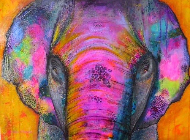
Gracie
Buddha Protects
On canvas 60 x 60 cm, this began by outlining the main features, then slowly building up the form and colour, beginning around the eyes and working outwards. There is quite a lot of collage, both found paper and hand painted. The warmth of the look comes from many layers of glazing with fluid and heavier bodied acrylics. This hangs over my bed,
guarding over me.
Pyjama Days
A self portrait on Watercolour paper, I used a wide range of materials – from fluid acrylics, pastels, crayons, pens and Gelatos., to try to get the right skin tone – and that ‘ageing” look!!!!
Eyes
Canvas 60 x 40 cm. I first collaged my own given symbol of the triple spiral which I collaged on from bought paper, then I drew in the eyes. I wanted a simple yet very bright, saturated look, which, however, still had great feeling and soul. Painted mainly with acrylics and fluid acrylics.
This was one of the defining moments of my life, and I just had to find a way to paint the lasting image which this breathtaking moment has etched in my memory. I knew that colour had to be the most important element, but that also the contrast between the brilliance of the sky, with the ever darkening structures of the canyon. Our gazes had shifted from down into the depths towards this miraculous sky in just a few minutes. I used many layers of acrylics and fluid acrylic paint, using a lot of texturizing techniques to avoid too much monotone and black in the lower half. I used a lot of both bought and home-made spray acrylics, too, to add texture and movement, as well as line work and mark making, both adding and subtracting layers to add interest and to lead the eye around the paged.
Linda Chaves linthepinkjournals@blogspot.pt
~~~~~~~~~~~~~~~~~~~~~~~~~~
Now Linda has one more piece of advice...
I find it much better to begin work when I have cleaned up and organized the studio after work the previous day. Washed up and cleared up. Ideally, knowing what I am going to do, I leave out everything I’ll need to make a start in the morning. I start the day uncluttered, not worrying about the mess which is inevitable during the day - then clean it all up at night. I make lists too. Lists of what I plan to do for the next day/week/month, etc. Lists of my ideas and inspirations. Lists of my intentions etc. These lists are my friends, I couldn’t live without them! It all helps me deal with the inner gremlins which sometimes conspire to ensure you do not want to get started. Some days it’s an all out war. But gremlins hate neatness, and loathe lists! Most days I win……
Hope you are inspired!!!


.jpg)
Love your work! Amazing!!
ReplyDeleteBeautiful art!! I like your brilliant colors and Gracie has stolen my heart ♥
ReplyDeleteThe colors you use are beautiful!
ReplyDeleteI shared Gracie on Facebook and pinned her on Jackie- Mixed Media-Art.
ReplyDeleteBeautiful work! So colorful and love all the details!
ReplyDeleteYes, Linda, I do still want to be a bug on your studio wall and sparkle the reflection of beautiful vibrant colors in your paintings. Hopefully we can get together one day.
ReplyDeleteI love your use of vibrant colors. Your art is beautiful!
ReplyDeleteLinda, your art is incredible and absolutely gorgeous!! Thanks so much for sharing here at AlteredPages with us!! hugs ")
ReplyDeleteEach piece of your artwork speaks to me. The bold colors wake me up! Thanks for discovering your talent.
ReplyDelete