
There are some techniques that are really popular and then fade away to be replaced by the newest craze. I first made Serendipity cards back in 2006. They were everywhere back then, but I haven't seen any lately. This technique is fabulous for using up scraps and odd bits that are on your desktop. You use coordinating colors or be totally random. The look will be different each time.
For today's card, I chose to use only colors that complimented the Sabor Papel designs. I chose Sabor because the designs go so well with my adorable Rubber Stamp Depot "Padre" stamp. I added a couple of their die cuts, some colorful tickets and pieces of ribbon. All of these were glued top and bottom with gel medium. It dries to a matte finish and is great for collaging.


For today's card, I chose to use only colors that complimented the Sabor Papel designs. I chose Sabor because the designs go so well with my adorable Rubber Stamp Depot "Padre" stamp. I added a couple of their die cuts, some colorful tickets and pieces of ribbon. All of these were glued top and bottom with gel medium. It dries to a matte finish and is great for collaging.

It looks like a bit of a mish mash, doesn't it? The magic happens when you start cutting this into squares. It's always a bit of a surprise what you're going to get if you cut it into squares without worrying about saving specific images.
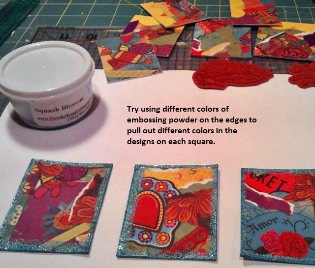
I dipped the corners of these into black pigment ink and then used Squash Blossoms embossing powder around the edges to bring out more of the blue in the designs. Ultimately, I chose the squares embossed just in black and saved these three for another project. Here are all 9 of the squares I got from this single sheet of Serendipity.

I settled on the three at the bottom which were embossed with black pigment ink and clear powder because it matched the way I stamped "Padre".

Because this image is the focal piece of the card I really wanted him to stand out so I gave him a faux-enamel look using Crystal Lacquer. I used a toothpick and a light touch to spread the lacquer just in his face.

The Serendipity squares have a lot of texture to them so I wanted to bump up the rest of the card. To do that, I used more of the same ribbon that I glued down in the original design and made a border with it.

Here is my finished background for this festive card. I glued them in place with Tacky Glue, but you could easily use double sided adhesive. This is where you decide if there are any areas you want to highlight or hide. I like the bright yellow large scrapbook border but the two squares together were a little much for my taste and I decided to add a die cut over the right square. But which design?

The Ole package of die cuts has the wonderful guitar design. LOVE IT! And it is the perfect size to bridge both halves of the card together.

And "Padre", being the focal point, goes in the center square. Two more little orange flowers were added to the squares ... just because I liked them and I thought the card needed more flowers.

Isn't he FESTIVE? I used him again to make the card below. Only this time, I skipped the lacquered face.

These two different designs of the Sabor Papel have the same basic color but one has black words and one has confetti. I used the word design behind the German Scrap frame. Rubber Stamp Depot's "Padre" and "Heart of Christ" were layered inside the frame. A few paper flowers, rhinestone gem stones and another Sabor die cut complete the look. Clear Stickles glitter glue make the flames on the heart die cut really stand out. A little rose Valentine sticker inside the heart finished it off!
You can find these fun papers, embellishments and inks at Altered Pages along with other everyday card making, scrapbooking and collaging supplies!
Like my cards? Come back tomorrow to see what the Design Team has to share with you. Until then, Happy Crafting!
gorgeous eye candy! beautifully done. xo
ReplyDeleteFabulous cards, Robin. Loved seeing how you put it all together.
ReplyDeleteThe use of the papers make for fabulous backgrounds! Love it!
ReplyDeleteGreat technique Robin!
ReplyDelete